Photographing wine labels (and other everyday objects) and uploading them to the social media picture site Instagram has produced a new term – being Instagrammable. This means that objects that photograph well using the camera on a mobile phone, by a person who is not David Bailey, come out top for being noticed and shared around. But what does this phenominum mean for the design and readability of wine bottle labels?
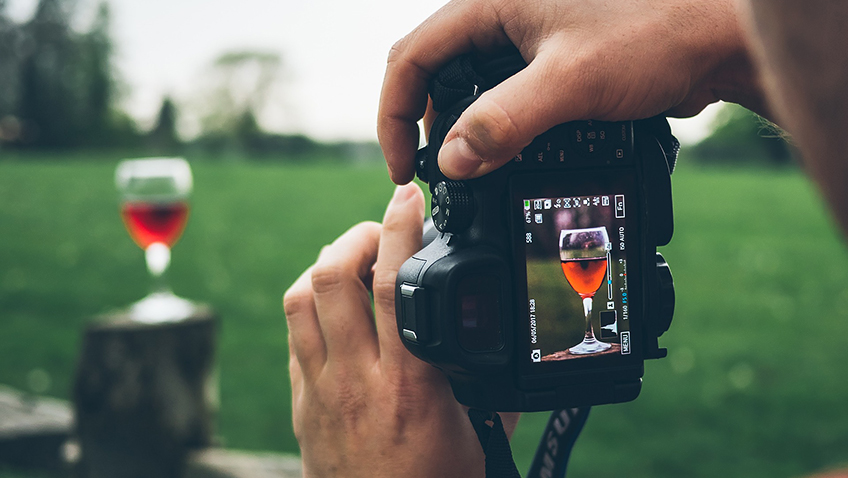
Using a mobile phone to a take a photo is a simple business – just point and ‘click’ (or press your thumb on the screen ‘button’). But as many mobile phones contain a wide angle lens this can distort any close-up shot (just compare yourself in a ‘selfie’ to a traditional camera photo and you’ll see your face in the mobile shot is often distorted giving you a large nose and small ears – not the most flattering image you’ll see of yourself so don’t believe it).
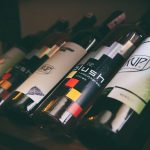
Wine bottles, and more specifically their pretty labels, are a popular choice for Instagram pictures. So should the wine industry be designing wine labels to with stand photographic distortion?
This is a difficult one as it could mean that to work on Instagram the wine label would have to be distorted (allowing it to be distorted again in the photo) in its original form – meaning the consumer eye-ball in the wine aisle would see an odd-looking label.
But there are other tricks of design that wine label designers can use to attract the photographic consumer – large, easy to read text styles; bold, constrasting colours or eye-catching images that are devoid of any text. All of which is good news for the older consumer who finds it difficult reading traditional wine label designs with curly text and a back label written in a text size that would do justice for the contents of an insurance document.
So who is producing these useful Instagrammable wines?
Well SPAR’s newly designed own-label wines are top of the list with their uncluttered and bold front labels which focus on the grape variety (a single word) or wine type (two words) against a contrasting colour (white or red for example).
There’s also Majestic’s own-label wines that contain just a whacky image on the front label (exploding fizz with two eyeballs poking through is a good one) and no text. While another Majestic offering Hey Malbec! does contain text but also the eye-catching image of a superhero (I have no idea why but it looks good in the camera).
Is this going to change the whole of the wine label design industry? Perhaps over time as more and more of us use some sort of electronic device to capture and share our tasting and eating pleasures – including the mature wine drinker. Why should we miss out?
PG Wine Reviews
SPAR Bold Red, Spain
£5 SPAR
Bold label but the wine inside is a little more subtle with plum and black pepper flavours and hints of violets.
Acacia Road South African Chenin Blanc 2017
£7.99 Majestic
Pretty yellow flowers dominate the bottle label of this wine while the inside contains creamy peach and pear flavours. A nice medium table wine.
Don Tomas Argentinean Shiraz 2016
£7.99 Aldi
A great wine but oh that wine label! Curly script against a black background make this wine label hard to read.
Hey Malbec! 2016, Argentina
£12.99 Majestic
Bold wine as well as a bold label with flavours of chocolate, cherry and blackcurrant with a bit of Bovril. A touch of violets too.
Tweet me a wine question @huxelrebe
© Paula Goddard 2018 www.paulagoddard.com